Do you know what Adaptive Cards are? Have you ever worked with them before? Perhaps you are a Microsoft Teams developer and you want to utilize Adaptive Cards in your bot or message extensions. Or maybe you are a Microsoft SharePoint Framework (SPFx) developer, and you need Adaptive Cards for your card views and quick views.
It is essential to understand what Adaptive Cards are, as all of these mentioned scenarios rely on them. In this article, I will provide a brief introduction to Adaptive Cards and guide you on how to create them for your applications. Developers can use Adaptive Cards to create engaging messages that are rendered into a native UI, adapting to the hosted app experience.
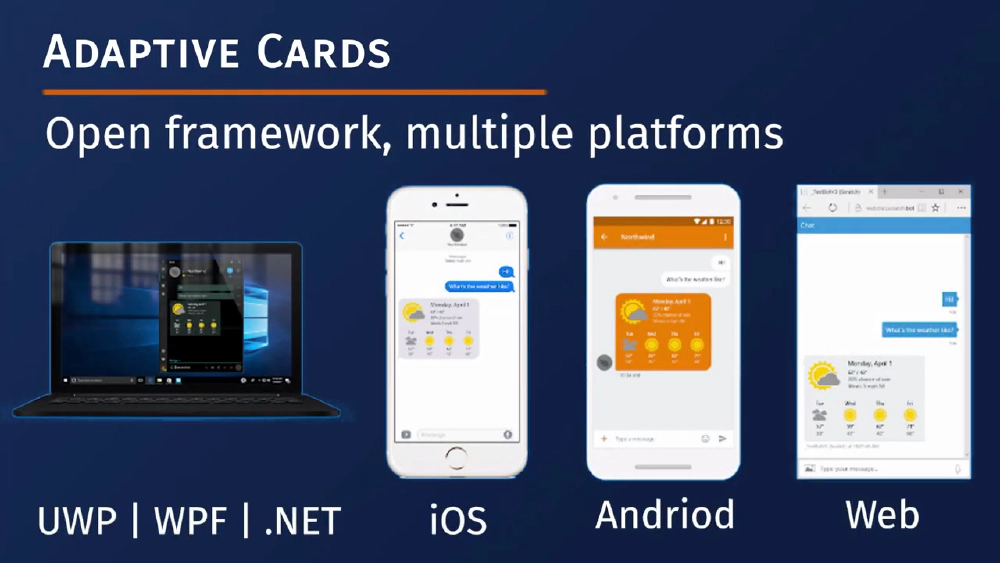
Adaptive Cards Overview
Adaptive Cards - Overview
Adaptive Cards are authored in JSON and can be used for various applications such as Outlook Actionable Messages, Microsoft Teams conversations, Viva Connections, dashboards, and more.
Adaptive Cards are platform-agnostic snippets of UI, usually in JSON format, that can be exchanged between apps and services. The JSON is then transformed into a native UI that automatically adapts to its surroundings.
This approach allows for the design and integration of lightweight user interfaces across different platforms and frameworks. The cards are created using an open card exchange format, enabling developers to exchange UI content consistently. Adaptive Cards can be rendered natively in host applications like Outlook, Teams, Microsoft Windows, Viva Connections, and even custom applications.
The goals for Adaptive Cards are as follows:
- They should be portable to any app device and UI framework.
- They should support open-source libraries and schemas.
- They should be easy to define and consume, with low cost.
- They should be expressive and cater to the wide range of content developers want to produce.
Adaptive Cards are purely declarative, eliminating the need for code. They are automatically styled to match the user experience of the host application and follow the app’s brand guidelines.
Benefits of Adaptive Cards
Adaptive Cards offer numerous benefits for both card authors and user experience owners. For card authors, Adaptive Cards provide a single schema and format, reducing the cost of creating cards and expanding their usability across various platforms.
With Adaptive Cards, authors have a wider range of options to align their content with their intended message. These cards work seamlessly across different applications, eliminating the need to learn new schemas. Additionally, authors can include input controls to gather information from users and create interactive forms within the card ecosystem.
This also means that developers can benefit from improved tooling shared across the board. If you’re an app developer seeking to leverage third-party content, Adaptive Cards ensure a consistent user experience by allowing you to control the card’s style.
Moreover, Adaptive Cards offer native performance as they directly target your UI framework. Content is delivered through secure payloads, eliminating the need to expose your UI framework to raw markup and scripting. Libraries are available to easily integrate Adaptive Cards into any platform you wish to support. By using an existing open schema, you save time by avoiding the need to invent, implement, and document a proprietary schema.
In summary, Adaptive Cards provide a versatile and efficient solution for creating visually appealing and interactive content across various applications.
Adaptive Card Schema
Adaptive Cards are now defined in a schema that includes a version. You can explore all Adaptive Cards in the Adaptive Card Schema Explorer, which indicates the version in which they were introduced. It’s important for developers to be aware of which elements are supported in each version of the Adaptive Cards Schema, as some application hosts may not yet support the latest version.
The schema is divided into multiple categories, including cards, card elements, containers, actions, inputs, type, and types.
Each category contains various elements. The Adaptive Card schema evolved from a messaging card format originally used in Microsoft Outlook. The basic structure of a card is generally as follows:
{
  "type": "AdaptiveCard",
  "version": "1.0",
  "body": [
    {
      "type": "TextBlock",
      "text": "Here is a ninja cat"
    },
    {
      "type": "Image",
      "url": "http://contoso.com/1.png"
    }
  ],
  "actions": [{
    "type": "Action.Submit",
    "title": "Back to Mission"
  }]
}
You have an Adaptive Card object, which serves as the root object that describes the Adaptive Card itself. It includes the markup, actions, and the required schema version for rendering.
The body of the card consists of building blocks known as elements. These elements can be combined in various ways to create different types of cards.
Cards also have a set of actions that users can take. This property describes those actions, which are typically displayed in an action bar at the bottom of the card.
Some additional properties include the body, which represents the card elements displayed in the main card region. The actions section is where actions are shown in the card’s action bar. There is also a select action, which is invoked when the card is tapped or selected. Additionally, there is fallback text, which is displayed when the client does not support the specified version. This text can contain markdown for rendering purposes.
Card Elements
The card elements consist of various controls that can be added to the body property of a card. These controls include elements like a text block, which allows for control over font sizes, weight, and color.
There is also an image control that enables the display of images. Additionally, a media control can be used to show a media player for audio or video content. To define the source for a media element, a media source element is utilized, which helps determine the type of media.
For instance, video would be represented as video/MP. Another useful element is the rich text block, which provides an array of inlines for inline text formatting. Moreover, the text run element defines a single run of formatted text.
Containers
The Containers category comprises elements used to group multiple elements together. These elements include an ActionSet, which displays a set of actions as shown below:
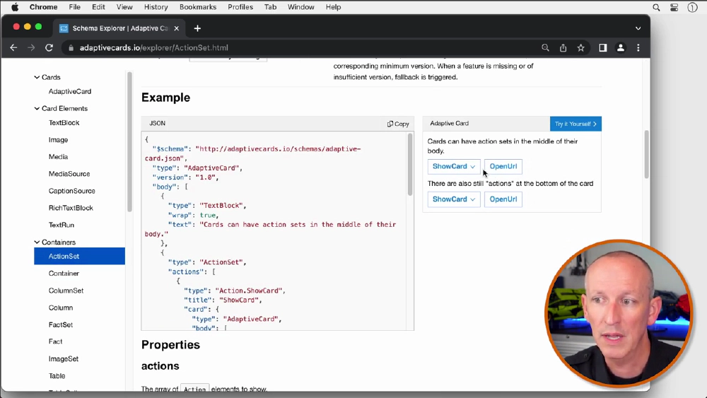
ActionSets group actions together
These two buttons will be listed in an ActionSet, which is a container that groups together various items.
The Column and ColumnSet elements allow you to define regions with columns, enabling elements to be placed side by side. This allows for the creation of table-like layouts.
A FactSet is an element that displays a series of facts, such as name-value pairs in a tabular form.
An ImageSet displays a collection of images, similar to an image gallery.
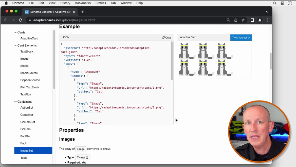
ImageSet shows images in a gallery rendering
The Table and TableCell components provide a way to display data in a tabular form.
Actions
Actions are used to invoke specific behaviors, such as opening a URL, submitting a card, or displaying another card.
- The
Action.OpenUrlis used to show a given URL, either by launching it in an external web browser or by displaying it within an embedded web browser in the client. - The
Action.Submitgathers input fields, combines them with optional data, and sends an event to the client. The client is responsible for determining how the data will be processed. For example, with Bot Framework-based bots, the client would send an activity through the messaging medium to the bot. - The
Action.ShowCarddefines an Adaptive Card that is shown to the user when a button or link is clicked. - The
Action.ToggleVisibilitytoggles the visibility of an associated card element. The target element represents an entry for the target visibility property of the actions. - The
Action.Executegathers input fields, merges them with optional data fields, and sends an event to the client. Clients process this event by sending an invoke activity of type Adaptive Card slash action to the target.
Inputs
Inputs are used to collect information from users, which can then be submitted to the host application or different systems.
The
Input.Textallows the user to enter text.The
Input.Numberallows the user to enter a number.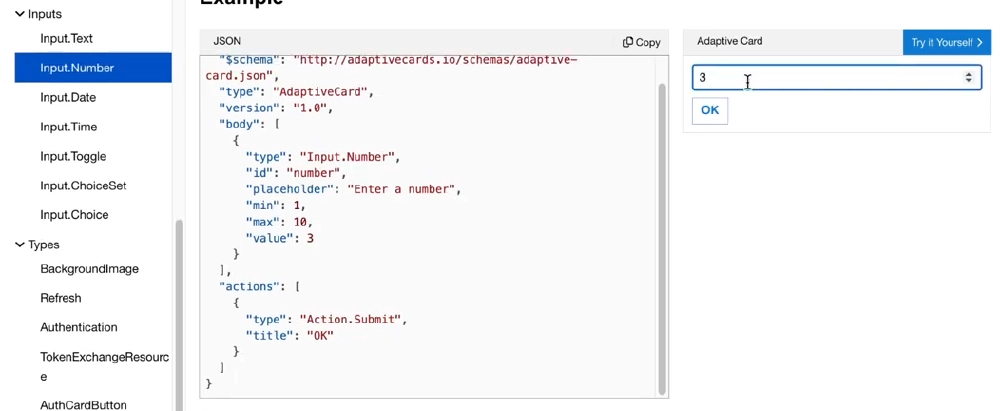
Input.Number Adaptive Card element
The
Input.Dateallows a user to choose a date.The
Input.Timeallows a user to select the time.The
Input.Togglelets the user choose between two options in a choice set, and the choice options allow a user to input their own choice.The
Input.Choiceset allows the user to input a choice.
Adaptive Card Designer
The Adaptive Card designer provides a rich interactive design experience for authoring your Adaptive Cards. It is one of the best tools available to you.
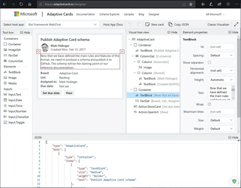
Adaptive Card Designer
The designers are available at the following URL: adaptivecards.io/designer. Whether you’re filling out a survey, approving an expense report, or updating a CRM sales opportunity, Actionable Message allows you to take quick actions directly within Outlook. Developers can now embed Adaptive Cards in emails or notifications, enhancing user engagement with their services and increasing organizational productivity.
Microsoft Teams also supports the latest versions of Adaptive Card schemas and offers multiple extensibility points. Developers can use Adaptive Card messages from bots in message extensions, as well as in task modules and tabs.
Explore the Adaptive Card online designer
Interested in seeing a demo on how to design and view the rendering of Adaptive Cards using the provided tools? Check out the video associated with this article for a comprehensive demonstration of the designer. You can directly access the demo part of the video with this link.
Conclusion
This article introduces Adaptive Cards and their use in applications like Microsoft Teams, Outlook, and Viva Connections. Adaptive Cards are platform-agnostic UI snippets that adapt to the host application’s user experience.
Learn more about Adaptive Cards by checking out the video associated with this article: What’s To Love About Adaptive Cards for Microsoft Teams & Viva?.

Microsoft MVP, Full-Stack Developer & Chief Course Artisan - Voitanos LLC.
Andrew Connell is a full stack developer who focuses on Microsoft Azure & Microsoft 365. He’s a 20+ year recipient of Microsoft’s MVP award and has helped thousands of developers through the various courses he’s authored & taught. Whether it’s an introduction to the entire ecosystem, or a deep dive into a specific software, his resources, tools, and support help web developers become experts in the Microsoft 365 ecosystem, so they can become irreplaceable in their organization.


