A few weeks ago I published a blog post on What’s up with Angular (v2.x / v4.x) and the SharePoint Framework. In that post I explained what is widely accepted as the challenge to using Angular within SPFx solutions: Angular wants to have a single root component on that page that loads all other components. This presents a few challenges, leading to my recommendation to avoid Angular + SPFx for now, but not for long.
Last week at the European SharePoint Conference 2017 (ESPC) in Dublin, Ireland, Rob Wormald presented on a new tech being added to the core of Angular that I think will make Angular much more approachable and useful to so many developers. Unfortunately, this session wasn’t recorded nor did I have the opportunity to attend due to co-chairing another conference in Orlando at the same time. I am familiar with the topic though as I’ve been assisting the Angular team in understanding SharePoint & the SharePoint Framework (SPFx) over the last few months. Over that time, I’ve become sold on this approach, not just for SPFx, but for Angular as a whole!
Angular Elements
This new tech I refer to above is called Angular Elements. It is part of Angular Labs, sort of like the R & D spot in the Angular team where ideas are explored & nurtured. Angular Elements will allow you to extend the reach of Angular applications by packaging them as custom elements. These custom elements are just part of the web component specification that has been implemented in some way by all the major browser vendors.
What’s the benefit to Angular Elements? Well, unlike an Angular application, for lack of a better term, it’s self-bootstrapping meaning it doesn’t need to belong to a root component on the page.
In addition, Angular Elements will serve as the bus between the custom element and the DOM to handle inputs & outputs (attributes) as well as events as they happen within the component. It also makes zones.js optional… another thing that we had to add to every SharePoint page in order to use Angular.
One of the most important aspects of Angular Elements is that once the Angular component is compiled, the deliverable artifact is just plain old JavaScript with no external dependencies to the page… including Angular!
Let that sink in for a moment…
You can use Angular 5.0 & Angular Elements to build your component as a custom element, then take the resulting JavaScript to another website to register your custom element and use it on the page without referencing Angular or any other framework!
In effect, I can build something with Angular Elements, give you a JS file and you can add a new element to a page for use… like this:
<html>
  <head>
    <script src="microsoft-cloud-show.js"></script>
    <script>
      // the following is defined in the above *.js file
      // class MsCloudShow extends HTMLElement {}
      window.customElements.define('ms-cloudshow', MsCloudShow);
    </script>
  </head>
  <body>
    <!-- render episode 200 from my podcast -->
    <ms-cloudshow show-episode="200"></ms-cloudshow>
  </body>
</html>
Take note of lines 3, 7 & 12… that’s it!
More Details Angular Elements
Rob has been talking about this new tech, Angular Elements, a few times recently… if you want to learn more about Angular Elements, I suggest you check out these two videos from recent presentations. While they don’t address SharePoint specifically, they do a good job of explaining the value proposition.
Web Components
How does this app happen? Angular Elements is leveraging one of the four APIs that is collectively referred to as Web Components. Specifically, it leverages the Custom Elements API which allows us to define new types of DOM elements.
They aren’t all that new… in fact if you’ve heard of the project Polymer, that’s a library for creating web components.
What’s great is all browsers support web components…
… well… almost all of them fully support web components…
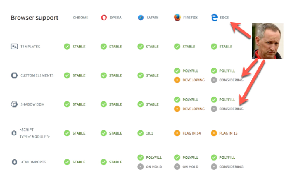
The browsers have different levels of support for web components and each of the different APIs. Chrome & Opera have the best support, followed by Safari. Firefox is actively developing support for custom elements & shadow DOM.
Microsoft’s Edge on the other hand is still listed as “considering” support even though this feature has over 10,000 votes, while there is at least a polyfill for the time being…

Browser Support for web components
More Details Web Components
Want to learn more about web components and custom components? Check out the official docs from Google & Mozilla:
- Google Developers | Web Fundamentals | Web Components
- Mozilla Developer Network (MDN) | Web Docs | Custom Elements
Furthermore, the concept of custom components came up during the Chrome Dev Summit recently and Rob had a great take that’s worth listening to: Chrome Dev Summit 2017.
Angular Elements & SharePoint Framework
So how does this impact us in the SPFx space? Using Angular Elements, you can build a component that can be used within a client-side web part or other SPFx component.
What does it look like? You can check out a sample repo of this in action… just remember this is still a work in progress: SharePoint/sp-dev-fx-angular.
Let’s look at this project together. I’m going to skip some boilerplate stuff that’s required to get it working within an SPFx project… I just want you to understand what you are looking at.
Create the Angular Component
First, create the Angular component like you normally would with Angular today. Within webparts/ngHelloWorld/elements/hello-world.ts you will find a simple component that has a single property name you can assign a value to (which is shown in the view webparts/ngHelloWorld/elements/hello-world.html):
import { Component, NgModule, Input, ViewEncapsulation } from '@angular/core'
import { BrowserModule } from '@angular/platform-browser'
import { CommonModule } from '@angular/common';

@Component({
  selector: 'hello-world',
  templateUrl: `./hello-world.html`,
  styleUrls: [ './hello-world.scss' ],
  host: {
    class: 'hello-world'
  },
  encapsulation: ViewEncapsulation.None
})
export class HelloWorld {
  @Input() name = 'Angular'
}

@NgModule({
  imports: [BrowserModule],
  declarations: [HelloWorld],
  entryComponents: [HelloWorld]
})
export class HelloWorldModule {
  ngDoBootstrap(){}
}
Then, using Angular Elements, register the component as a custom element, as shown on line 9 in webparts/ngHelloWorld/elements/index.ts:
//web components ES5 shim
import '../../../elements/wc-shim'
import { registerAsCustomElements } from '@angular/elements';
import { platformBrowser } from '@angular/platform-browser'

import { HelloWorld, HelloWorldModule } from './hello-world'
import { HelloWorldModuleNgFactory } from './hello-world.ngfactory'

registerAsCustomElements([HelloWorld], () => platformBrowser()
                         .bootstrapModuleFactory(HelloWorldModuleNgFactory, {ngZone: 'noop'}))
  .catch(err => console.log(err));
Finally, import it into your client-side web part and add the element to the web part’s DOM element as shown in lines 11-13 in webparts/ngHelloWorld/NgHelloWorldWebPart.ts:
import './elements'
import { HelloWorld } from './elements/hello-world'
import {
  BaseClientSideWebPart, IPropertyPaneConfiguration, PropertyPaneTextField
} from '@microsoft/sp-webpart-base';

export default class NgHelloWorldWebPartWebPart extends BaseClientSideWebPart<HelloWorld> {
  constructor(){ super(); }
  ngElement: HTMLElement;

  public render(): void {
    this.domElement.innerHTML = `<hello-world name="${this.properties.name}"></hello-world>`;
  }

  protected getPropertyPaneConfiguration(): IPropertyPaneConfiguration {
    return {
      pages: [{
        header: { description: 'Description' },
        groups: [
          {
            groupName: "Options",
            groupFields: [
              PropertyPaneTextField('name', {
                label: "Username",
                value: "Rob"
              })
    ]}]}]};
  }
}
That’s it! Pretty clean huh?
Better yet, you can take the same Angular Element and drop it on a page that has no web framework or one that uses Vue.js, React or jQuery using the syntax I showed above and it works the same way!
What do you think? Drop a mention in the comments below!
Awesome! Now What?
Now we wait… this isn’t ready for prime time. There is still a lot to get worked out, but the POC is there. From what I understand we’re just a few months away… maybe less.
Stay tuned… the story is shaping up quite nicely!
Oh… and for those of you who have subscribed to my Mastering the SharePoint Framework course, rest assured… this WILL be covered in a chapter once it’s final as this is likely to be my preferred way of doing SPFx development!

Microsoft MVP, Full-Stack Developer & Chief Course Artisan - Voitanos LLC.
Andrew Connell is a full stack developer who focuses on Microsoft Azure & Microsoft 365. He’s a 20+ year recipient of Microsoft’s MVP award and has helped thousands of developers through the various courses he’s authored & taught. Whether it’s an introduction to the entire ecosystem, or a deep dive into a specific software, his resources, tools, and support help web developers become experts in the Microsoft 365 ecosystem, so they can become irreplaceable in their organization.


