Microsoft released the SharePoint Framework (SPFx) v1.19 on April 30, 2024. This release features one new thing, a few updates, and one deprecation. This update included the following things:
- ✅ new ACE template for displaying line chart data visualization
- ♻️ one minor update to the ACE search template
- ♻️ update one dependency
- 👓 accessibility improvements to web part property pane controls for
- 🪦 one deprecation
This is a relatively small release, probably in preparation for the Microsoft 365 Community Conference in early May in Orlando and the Microsoft Build Conference in Seattle later in May.
So, let’s get started!
What new?
A new template for Adaptive Card Extensions (ACE) has been added to the SharePoint Framework (SPFx). The data visualization card template enables the creation of simple charting solutions within our ACEs.
This template is specifically designed for implementing line charts. It allows us to display one or more line charts that represent a series of data, providing a quick overview of how data progresses over time.
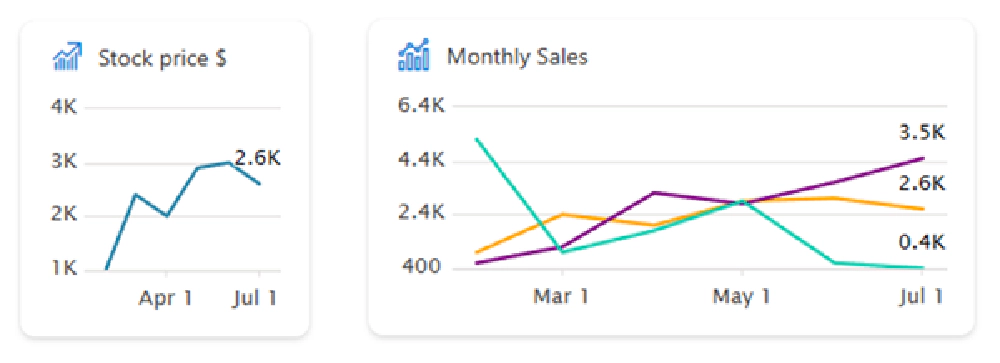
Example Data Visualization ACEs
On the X-axis, you can specify the date. On the Y-axis, you set the value.
If you have more than one item listed, for instance, three items, you can also specify their colors. The implementation is simple and straightforward. If you’ve previously worked with any ACE, it’s essentially the same process.
const seriesData : IDataPoint<Date>[] = [
  { x: new Date(2024, 1, 1), y: 1000 },
  { x: new Date(2024, 2, 1), y: 2400 },
  { x: new Date(2024, 3, 1), y: 3100 },
];

export class CardView extends BaseComponentsCardView<..> {
  public get cardViewParameters(): IDataVisualizationCardViewParameters {
    return LineChartCardView({
      cardBar: {
        componentName: 'cardBar',
        title: this.properties.title
      },
      body: {
        componentName: 'dataVisualization',
        dataVisualizationKind: 'line',
        series: [{
          data: seriesData,
          lastDataPointLabel: '3.1K'
        }]
      }
    });
  }
}
In the line chart card view object, we can specify a data visualization type using the body property. Currently, this is set to line, suggesting we might be able to use other types like pie charts in the future.
There’s another property called series, an array containing a collection of objects. These objects have two properties: data and lastDataPointLabel. The lastDataPointLabel property allows us to label the chart or line at the final data point.
The data property represents a series of data with x and y coordinates. The x coordinate is a date, and the y coordinate is a value you specify. This is how the graph will be displayed.
For larger cards, you have the option to position the chart on the right-hand side and include a title component or header, such as a sales projection.
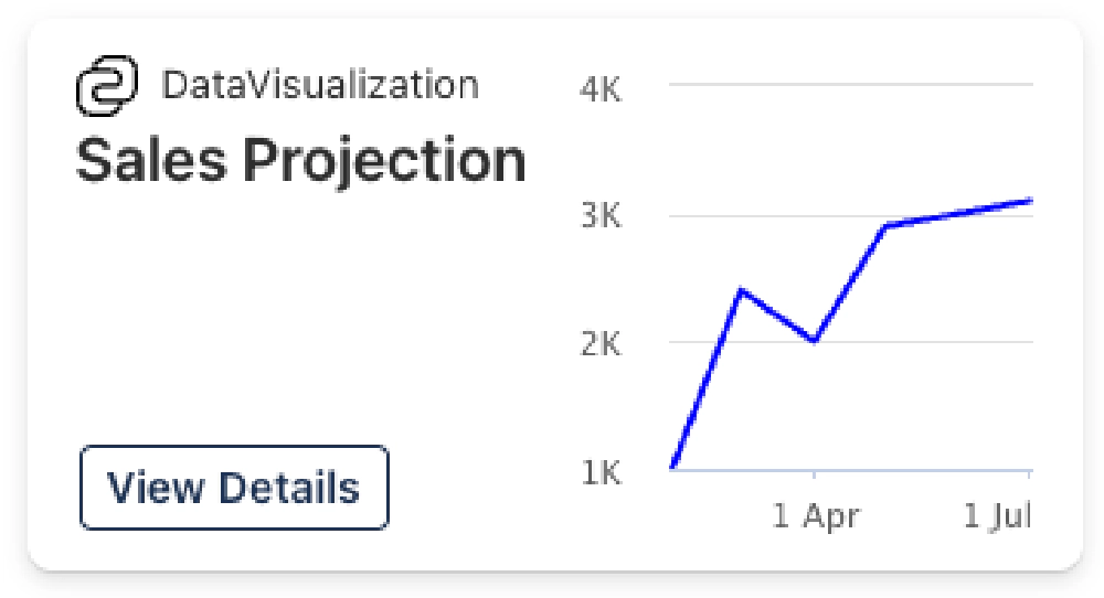
Large card rendering with chart to the right.
In the footer, you can also specify an action, such as selecting a button to open a QuickView. This will provide even more data or details about the information you’re viewing.
What changed?
Now, let’s discuss the changes Microsoft has incorporated in this release of the SPFx.
Upgrade Webpack to v5
A significant update is the upgrade of the webpack version from v4 to v5, specifically to v5.88.1.
This is a welcome update, given that webpack v5 has been available for nearly four years, having been released in October 2020.
This change is unlikely to greatly affect your SPFx projects unless you’re customizing the webpack configuration, as demonstrated in the Ultimate bundle of my Mastering the SPFx course.
ACE Search Template
Another change affects the ACE search template. The footer property, which was once required, is now optional. It’s no longer necessary to include it.
Fluent UI React Was Not Updated
I want to clarify a point that’s not in the release notes but has caused some confusion.
Microsoft incorrectly stated in several instances, such as the community call on May 16, that the latest SPFx release included an update to the Fluent UI React version supported in SPFx. Until now, we’ve been using Fluent UI React v8, which was added to SPFx in the v1.18 release in September 2023.
There’s been some confusion that Microsoft updated this to Fluent UI React v9 in the SPFx v1.19 release.
This is not accurate. There has been no change.
The current version of SPFx v1.19.0 still uses Fluent UI React v8, specifically v8.106.4.
Web Part Property Pane Accessibility Updates
Additionally, Microsoft has made some updates to web part property pane controls, mainly focusing on accessibility. I noticed some features were missing from these controls a few SPFx releases ago, and highlighted these issues in the issue list.
It appears Microsoft has been rectifying and updating those. This includes several updates included in this SPFx release.
So, what did they update? The following controls had these properties added:
- PropertyPaneCheckbox:
ariaLabel - PropertyPaneChoiceGroup:
imageAlt - PropertyPaneDropdown:
ariaDescription - PropertyPaneIconPicker:
disabled - PropertyPaneThumbnailPicker:
disabled - PropertyPaneToggle:
inlineLabel
Previously, the label control displayed the label on one horizontal line, with the toggle control and its “on” and “off” text on the next line. Now, if you set the inline label, everything will be displayed on a single line, rather than being separated across two lines.
Deprecations
This release includes a single deprecation.
Microsoft removed support for Node.js v16 in the SPFx v1.19 release. This means that Node.js v18 is the only supported version for SPFx v1.19 (SPFx v1.18 also supports Node.js v18).
That’s a wrap on the latest release of the SharePoint Framework, v1.19!
So far I haven’t seen any issues get reported from the SPFx v1.19 release, but history has shown us that there’s almost always a regression with one of these releases. Usually I recommend developers hold off on upgrading your projects for about 3 weeks, but as this release has been out for a few weeks, I think you’re safe to move forward.

Microsoft MVP, Full-Stack Developer & Chief Course Artisan - Voitanos LLC.
Andrew Connell is a full stack developer who focuses on Microsoft Azure & Microsoft 365. He’s a 21-year recipient of Microsoft’s MVP award and has helped thousands of developers through the various courses he’s authored & taught. Whether it’s an introduction to the entire ecosystem, or a deep dive into a specific software, his resources, tools, and support help web developers become experts in the Microsoft 365 ecosystem, so they can become irreplaceable in their organization.
