Microsoft released an update to the SharePoint Framework (SPFx) with version v1.17 in early April 2023. This release includes approximately 20 changes, new features, such as API and SDK improvements, dependency updates, and improvements for the developer experience.
However, only just over half of these changes are listed in the official release notes. In my research, I found an additional 40% of changes.
This article covers all of these changes, so you can get the complete details on the SPFx v1.17 release.
Watch Video for a Chance to Win! 🏆
Too much to read? Check out the video version of this article on my YouTube channel and you’ll have a chance to win a free lifetime license to my new course, Building SharePoint Framework Web Parts & Property Panes, to one lucky viewer. Full details are in the video.
I’m going to break this down into a few main sections:
- First, I’ll examine changes related to the different SPFx components you can create.
- Next, I’ll take a look at changes to the SPFx APIs and SDKs.
- Finally, I’ll go over a handful of changes to the developer experience and changes to all projects, such as the generator and dependencies.
So, let’s get started with changes to components, specifically Web Parts.
SPFx Components - Web Parts
The SPFx v1.17 release includes two features that are specific to web parts.
Added ariaLabel property to the Property Pane Link Control
The PropertyPaneLinkControl available to developers in the property pane was missing the accessibility property ariaLabel. This property allows developers to describe an interactive element, which is useful for screen readers.
It seems that this was an oversight dating back to the early days of SPFx, as other controls have this property. However, it appears that it is also missing on the PropertyPaneCheckboxcontrol.
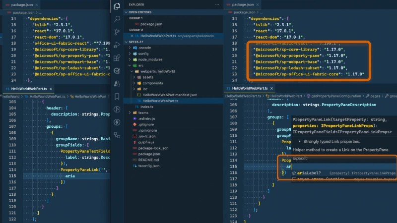
Property Pane Link control accessibility improvement
🐞 Shouldn't the Checkbox Get the Same Property?
If you agree, I’ve added an issue for those two controls in the SPFx issue list. Jump to the issue and give it a thumbs-up reaction to increase visibility to Microsoft: 🐞 sharepoint/sp-dev-docs#8876.
Web Part Top Actions now Generally Available
Microsoft introduced a new way to interact with web parts in the SPFx v1.16 release with Top Actions. Although previously in developer preview, these controls are now generally available in this SPFx release.
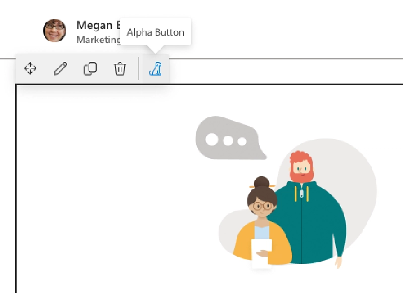
Web Parts - TopActions
The purpose of these controls is to provide an alternative to editing web parts from the property pane. In my opinion, top actions are the first step towards eventually replacing the property pane.
When you add a web part to a page and put it in edit mode, you will see either a button or a drop-down control you can click. By handling the click event in the code, you can execute any desired action.
Unfortunately, creating Top Actions is a little tough because they don’t seem to work in the SharePoint hosted workbench. The only way I was able to see them work is when I packaged and deployed the project to my SharePoint site and added it to a real SharePoint page.
When Microsoft released this feature in SPFx v1.17, they included some docs that are, well, pretty sloppy. Plus, they include code samples that simply won’t compile because they reference things in the API that don’t exist. Furthermore, some aspects of the Top Actions features work conflict with the API documentation.
🐞 TopActions Documentation Bugs
I’ve bugged these issues with the TopActions documentation if you want to track them: 🐞 sharepoint/sp-dev-docs#8874.
SPFx Components - Adaptive Card Extensions
Next up: Adaptive Card Extensions. There are a few updates here, including one minor thing I found in my research that was not included in the release notes.
Support for Adaptive Card v1.5 Schema
Microsoft has upgraded the version of the Adaptive Cards schema supported by ACEs to v1.5. This is a significant update, as ACEs have only supported the v1.3 Adaptive Card schema until now. It’s also overdue, as the v1.5 Adaptive Card schema was released in October 2021, nearly one-and-a-half years ago.
So, what’s new in this update that wasn’t available before?
The v1.4 schema added support for a refresh and authentication property that defines how the card can be refreshed by making a request to a targeted bot, and to enable on-behalf-of single sign-on or just-in-time OAuth.
The v1.5 schema includes several improvements to Adaptive Cards, such as:
- Support for right-to-left rendering of the container and column types
- Ability to mask the text input control for scenarios like passwords
- Support for overflow for action sets when you want to show more actions than the rendering will support
- Support for a tooltip on actions to give the user a hint on what the action does
- Update the Input.ChoiceSet to support a static list of choices
- Update actions to support disabling a button
- The ability to render tables of data, which may be the biggest improvement yet.
Refer to the AdaptiveCards.io website for detailed information on all of these features.
Added onBeforeAction() Handler to CardViews & QuickViews
All card implementations contain an onAction() handler that you use to handle actions submitted on the Adaptive Cards used in the two different views available in ACEs.
This release adds a new onBeforeAction() handler that’s raised before the action is executed. You can’t change the flow of the action, but you can do things like add extra logging or telemetry to your solution.
export default class NasaApolloMissionsAdaptiveCardExtension extends BaseAdaptiveCardExtension<
  INasaApolloMissionsAdaptiveCardExtensionProps,
  INasaApolloMissionsAdaptiveCardExtensionState
> {
  // ..

  public onBeforeAction(action: IOnBeforeActionArguments): void {
    console.log('ACTION FIRED:', action);
  }
}
Card Accessibility Improvements
This release includes an accessibility improvement for the ACE QuickView. A new property, focusParameters, has been added to the QuickView class, which enables you to set the focus on a specific control in the Adaptive Card. By default, the first control in the card has focus, but you can now change that with this property.
To do this, override the focusParameters() accessor and return an object of type IFocusParameters. This interface contains two properties: the required focusTarget property returns the ID of the element in the Adaptive Card that should have focus, and an optional property ariaLive that has three options you can set for screen readers. This can be set to polite, which is read by the screen reader when the user is idle, assertive which disrupts any announcement in favor of this property, or off which tells the screen reader to not read the contents.
export class QuickView extends BaseAdaptiveCardView<
  IHelloWorldAdaptiveCardExtensionProps,
  IHelloWorldAdaptiveCardExtensionState,
  IQuickViewData
> {
  public get focusParameters(): IFocusParameters | undefined {
    return {
      focusTarget: 'mission_name',
      ariaLive: 'polite'
    }
  }
}
At the time of release, this feature is not supported in the Viva Connections mobile app experiences.
Default ACE icon changed to Microsoft 365 (from SharePoint)
Another noteworthy change that was not included in the release notes is the default ACE project icon. The SharePoint logo was previously used as the initial icon for the control in the Yeoman generator.
In the SPFx v1.17 release, the SharePoint logo SVG file was removed from the default project and replaced with a reference to the hosted Viva Connections logo.
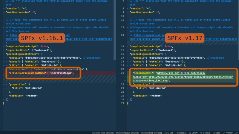
ACE Projects Have a New Default Icon
Default ACE QuickView Template Schema Still uses v1.2
Another thing I noticed is that the version Adaptive Card template added for a QuickView with the Yeoman Generator still uses the v1.2 schema. That’s annoying as now you’ll have to change it every time you want to create a project.
🐞 Bugged Default Adaptive Card Schema
I bugged this oversight so hopefully it gets fixed in the next release. 🐞 sharepoint/sp-dev-docs#8878.
SPFx API Changes - Microsoft Entra ID
Now that we’ve reviewed the changes for different SPFx component types, let’s look at some API and SDK changes as part of the SPFx release.
AADTokenProvider - Include Claim Parameter when Requesting Access Tokens
This new capability added in SPFx v1.17 is not something most people will encounter. If you don’t understand what I’m saying, you likely won’t need it. But there may be one scenario where you’ll think “oh yeah, this unblocks that one problem we have!”
Let’s first understand the scenario this feature addresses.
When you request an access token from an OAuth2 provider, like Microsoft Entra ID, for a resource, the owner of that resource may have configured it so that you must include specific claims when requesting a token. For example, the endpoint may require the user requesting the token to perform two-factor authentication, or not satisfy a conditional access policy. If you request an access token without that claim, the resource and Entra ID will respond with an claim challenge that indicates the access token you sent has insufficient claims. To get past this, you need to include the claim in the token request.
Until SPFx v1.17, the API, specifically the AADTokenProvider, didn’t provide a way to do this. But now, the AADTokenProvider.getToken() method in SPFx v1.17 supports an option object as a second parameter. You can use this to preempt the claim challenge with the claim parameter it will expect.
In this example, I’m including a claim parameter that satisfies a conditional access policy requirement.
const claimParam = {
  "access_token": {
    "acrs": {
      "essential": true,
      "value": "cp1"
    }
  }
};
const provider = await this.context.aadTokenProviderFactory.getTokenProvider();
const token = await provider.getToken(
  'https://api.voitanos.io',
  { claims: JSON.stringify(claimParam) } // << new in SPFx v1.17
);
You can learn more about claim challenges, requests, and client capabilities from the Entra ID docs.
AADTokenProvider - Support the OAuth2 Popup Flow
The other improvement to the AADTokenProvider is support for the popup flow.
Again, like last time, let’s first understand the scenario this feature addresses.
Let’s say you’ve created an SPFx web part that needs an access token to call some API. Normally things work just fine – you’re already signed into Entra ID in order to access SharePoint Online, so SPFx can just leverage the authentication cookie in your request to validate your identity.
However, in our new-ish security-minded world, browsers now support blocking third-party cookies that were commonly used to track users across sites by ad platforms. Unfortunately, this affects authentication scenarios that use the same technology.
So, when a token is requested and Entra ID doesn’t know who you are, it has to prompt you to authenticate. Usually, this can be handled with a redirection, prompting you to sign in again, but that doesn’t always work.
For instance, if your SPFx web part is used to implement a Microsoft Teams tab and is rendered within an <iframe>, the redirection won’t work because Entra ID won’t allow its sign-in page to be hosted within an <iframe> to protect against clickjacking.
Or, if you’re using the web part in SharePoint Online and a user is using Safari with Intelligent Tracking Protection (ITP) enabled (which blocks third-party cookies), when your web part requests an access token, it will trigger a full page refresh.
Until SPFx v1.17, the AADTokenProvider API didn’t support the popup experience. But now it does. To take advantage of this, you need to set the argument IsEnabledAppAuthPopUpEnabled property on your tenant to true using the Set-SPOTenant PowerShell cmdlet.
You can then implement the event handler AADTokenProvider.popupEvent that you can use to initiate the popup experience, as most popups are automatically blocked by browsers unless initiated by a user gesture.
SPFx API Changes - Microsoft Teams
Let’s discuss some of the SPFx API changes related to Microsoft Teams.
Microsoft Teams JS SDK Updated
The first update is an update to the Microsoft Teams JS SDK. Before SPFx v1.17, SPFx was using v2.4.1 of the Microsoft Teams JS SDK, but this release bumps that up to v2.9.1. This adds support for the Live Share API.
“Sync To Teams” App Manifest Updated
The “Sync to Teams” feature in SharePoint Online’s Tenant App Catalog can take an SPFx solution that contains components that can be used in Microsoft Teams and automatically create & deploy the Microsoft Teams app package automatically for developers.
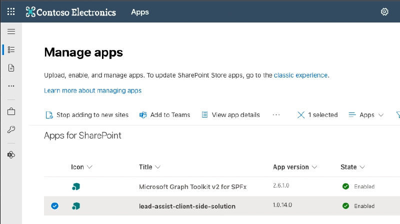
Tenant App Catalog: 'Sync to Teams' or 'Add to Teams'
Prior to SPFx v1.17, the app manifest used was v1.8. This meant if you wanted to use a feature in Microsoft Teams implemented with your SPFx components, such as a Meeting App, you had to manually create the Microsoft Teams app manifest and package rather than rely on the “Sync to Teams” feature.
However, in coordination with the SPFx v1.17 release, “Sync to Teams” now uses the latest Microsoft Teams app manifest, version 1.16.
You don’t have to do anything to take advantage of this. It’s not part of the SPFx release, but rather a change to the feature in SharePoint Online that was timed alongside the SPFx v1.17 release.
Support SharePoint Pages loaded in Web Parts in <iframe>
This next feature is quite an edge case. When using an SPFx web part as a Microsoft Teams tab, if your web part displays a SharePoint page, you need to configure the web part to force its rendering within an <iframe> instead of rendering it within a <div> element like it normally does.
To do this, set the supportsSelfFramingInTeams property on the web part’s manifest.
🐞 Web Part JSON Schema Incorrect
Heads up - at the time of publishing this article, it seems Microsoft forgot to update the JSON schema for the web part manifest. The property listed above, typo and all, isn’t in the JSON schema. I’ve bugged this so hopefully they’ll fix it soon: 🐞 sharepoint/sp-dev-docs#8873.
Tooling & Developer Experience Changes
The SPFx v1.17 release includes a few changes to the tooling and developer experience.
Set the Preferred SharePoint Hosted Workbench Site
The first one is a nice productivity improvement. Previously, when you created a new SPFx project, you needed to manually update the serve.json file in the project’s config folder to point to the domain where your SharePoint Online Hosted Workbench was that you wanted to test your component against.
That was a pain to do every single time.
However, now that string we used to have, the one with enter-your-SharePoint-site in the URL, has been updated to include the string {tenantDomain}. Now, when you run the gulp serve task, it will look for an environment variable SPFX_SERVE_TENANT_DOMAIN set on your workstation and use that to replace the {tenantDomain} string.
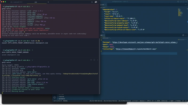
Gulp Serve Task Improvements
caption under title (supports markdown)
Now, any project you run, even one created by a colleague or one you pull off of GitHub, will use your preferred hosted workbench without any extra effort!
Change in Yeoman Generator’s Welcome Message
I noticed a small change that was not included in the release notes. Previously, when you created a new project, the generator would say “Welcome to SharePoint Online. Let’s create a new SharePoint solution.”
Now, as part of the shift from SharePoint to Microsoft 365, it says “Welcome to Microsoft 365. Let’s create a new Microsoft 365 solution.”
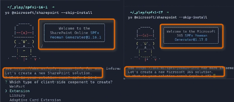
Yeoman Generator Updated Welcome Message
However, the last confirmation message still shows the SharePoint logo in ASCII art, indicating that something was forgotten!
🐞 Bugged ASCII Logo
Yup, I bugged ASCII Microsoft 365 logo too: 🐞 sharepoint/sp-dev-docs#8875.
Core Project Dependencies
Lastly, let’s cover the core project dependencies that were updated. There’s nothing you need to do here. All your new projects will automatically receive these changes.
Note that none of these dependencies are listed in the release notes at the time this article was published.
Office UI Fabric React Updated
The Office UI Fabric React package, which is part of Fluent UI, has been updated to v7.204.0, the latest version as of the release. This is just a small bump from v7.202.0 found in the previous version of SPFx.
Rush Stack Compiler for TypeScript v4.5 Updated
The Rush Stack Compiler used by the build engine to decouple SPFx from the version of TypeScript has been updated to v0.4.0.
Webpack Updated
Finally, the version of Webpack used to create the bundles has been updated to use v5.77.0.
ESLint - Explicit Dependency Added
Two changes to ESLint were not included in the release notes.
One of them was explicitly setting the version of ESLint used by SPFx projects in the project’s devDependencies section of its package.json file. Previously, SPFx relied on the fact that underlying dependencies were including ESLint, but that meant that SPFx was not controlling the version used.
For example, in the previous version, SPFx v1.16.1, your project was using ESLint v8.30.0, which came from some underlying dependency. But now, it is explicitly set to v8.7.0.
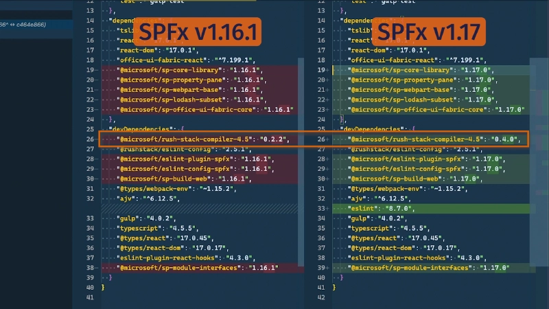
ESLint Explicit Dependency
I wonder what caused them to do that? Someone must have run into something. Oh well… it doesn’t matter at this point.
ESLint - Rule Name Changed
Another change I noticed was a rule that was changed in the default .eslintrc.js file added to your projects. Previously, the rule @typescript-eslint/no-parameter-properties was set, but apparently that rule was deprecated in favor of @typescript-eslint/parameter-properties by the TypeScript or ESLint team recently. So, the SPFx team just updated it to use the correct term.
Conclusion
Whew… we’re done!
Quite a few changes, don’t you think?! To recap, while Microsoft included about 11 of these 20 things I just ran through in their release notes, the other 9 came from me picking through the codebase of the release notes.
What do you think about the updates I’ve covered in this SPFx release? Do you see them as a positive move, or are you disappointed by how small of a bump it was? Did you find value in this kind of in-depth review beyond what you get from the release notes? It takes a lot of work to do this, so I want to make sure it’s worthwhile to keep doing this. Let me know by reaching out on Twitter (links below), or leave a comment on the YouTube video associated with this article.

Microsoft MVP, Full-Stack Developer & Chief Course Artisan - Voitanos LLC.
Andrew Connell is a full stack developer who focuses on Microsoft Azure & Microsoft 365. He’s a 22-year recipient of Microsoft’s MVP award and has helped thousands of developers through the various courses he’s authored & taught. Whether it’s an introduction to the entire ecosystem, or a deep dive into a specific software, his resources, tools, and support help web developers become experts in the Microsoft 365 ecosystem, so they can become irreplaceable in their organization.
