On February 17, 2022, Microsoft released v1.14 of the SharePoint Framework (SPFx). In this post, I’ll summarize what you can find, and share some additional details I found after spending some time picking apart this latest release of SPFx.
But, before I get started though, I want to call something out.
Last August, Microsoft hired Alex Terentiev straight from the community to join the SharePoint Framework (SPFx) team. Alex is one of the leading thinkers when it comes to SPFx… he’s probably the best one who’s found issues or edge cases with SPFx extensions.
I was cautiously optimistic when I saw the news he joined, I was hoping that they’d turn him loose to do what’s right. That’s sure what it seemed like from my cheap seats!
While I might be reading to much into it, and I might be unfairly giving too much credit to one person, consider the following:
- Since joining, he’s been involved in 300+ issues in the sharepoint/sp-dev-docs repo, closing over 70% of them!! 👇 more on that later👇
- SPFx v1.14 features a bunch of investments & improvements to SPFx list view command set extensions in v1.14. Much of those extensions improvements smell a lot like the stuff he’s taken exception to for years.
So… tip of the hat to Alex… well done, keep it up, and good hire Microsoft!
OK… enough platitudes… let’s dig into this release!
What’s new?
Everyone likes new toys… so let’s dig in!
Image Helper API
This was initially listed in the SPFx v1.13.1 release notes, but when I dug in, that seemed like a mistake. Sure enough, it was! While it was available as a preview feature, it would have been near impossible for anyone to figure out how to use it and get it working.
No fear… I figured it out thank to a little help from the engineer who wrote the feature and submitted a doc in PR#7701 that explains how it works.
The idea is that you can pass a URL of an existing image, the desired width, and this API will resize the image server side, save it in a cache, and return the URL to the new image.
For example, say you’ve got a huge image (1920x1080 & 1.2MB) you don’t want to show on a web page that’s stored in the site’s Documents library.
Using the ImageHelper.convertToImageUrl() static method, you can pass in the URL to the image & the desired size, and get a much more web-friendly image (400x225 & 30kB) as shown in Figure 1:
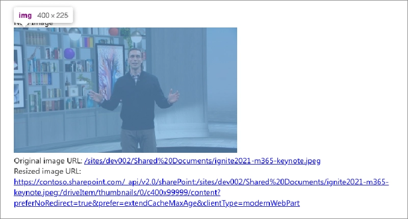
Figure 1: Example usage of Image Helper AP
You’ll find this in a new npm package, @microsoft/sp-image-helper. Learn more by reading my new entry in the docs: Microsoft: Image Helper API.
Image Helper Isn't Generally Available
Seems there was a miscommunication with respect to this feature. When I was asked to write the docs for this feature, it was my understanding that the feature would be included as generally available in the SPFx v1.14 release (as indicated in the SPFx v1.14 release notes).
Apparently that wasn’t the case. The docs will be updated to reflect that this feature was included in the SPFx v1.14 as a developer preview release but will be generally available in the SPFx v1.15 release.
Updated SPFx generator prompts
Another change in this release is one I’m particularly fond of. A bunch of prompts have been retired in favor of their default settings. Now, it’s assumed you want to deploy your solution to the entire tenant and your web parts aren’t isolated. And all those description prompts are gone!
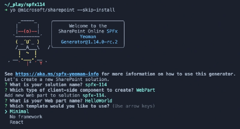
Figure 2: Updated SPFx generator prompts & template options
But if you want to change anything, no worries… you can always go into the files in your solution and change the default to something you like.
To make this clear, we added a page to the docs, https://aka.ms/spfx-yeoman-info, that explains what prompts were retired, what the defaults are, and where you can make the necessary changes if you need to.
New & updated project templates
Microsoft also introduced new project templates, mostly for Web Parts, in this release. Now, when you create a Web Part, you get three template options to pick from as you can see from Figure 2 above.
A new project template option, Minimal, was added to the SPFx generator in SPFx v1.14. This project template option includes no theme or host environment code in new projects.
For example, a new web part project starts with the following code, representing the minimal code necessary to run the web part:
export default class HelloWorldMinimalWebPart
          extends BaseClientSideWebPart<IHelloWorldMinimalWebPartProps> {

  protected onInit(): Promise<void> {
    return super.onInit();
  }

  public render(): void {
    this.domElement.innerHTML = `<div class="${ styles.helloWorldMinimal }"></div>`;
  }

  protected get dataVersion(): Version {
    return Version.parse('1.0');
  }
}
How Do You Properly Initialize Your Component?
Learn why, in this case, why the onInit() method is a better option than using the class constructor in my article:
SPFx Basics: Initializing components - constructor vs. onInit()
The other two options, No framework & React, are similar to the old versions, but include code that provides theme & context with the current environment the web part is running within, such as Microsoft Teams or SharePoint Online.
You can see the differences in the default web part code for each project type. Both get a pair of new methods. The _getEnvironmentMessage() method returns a string indicating if the component is currently running in SharePoint or Microsoft Teams and if it’s deployed to production or in development (served from localhost). The onThemeChanged() determines if the current theme is in dark mode and applies some changes to properties based on the current theme colors:
private _getEnvironmentMessage(): string {
  if (!!this.context.sdks.microsoftTeams) { // running in Teams
    return this.context.isServedFromLocalhost
        ? strings.AppLocalEnvironmentTeams
        : strings.AppTeamsTabEnvironment;
  }

  return this.context.isServedFromLocalhost
        ? strings.AppLocalEnvironmentSharePoint
        : strings.AppSharePointEnvironment;
}

protected onThemeChanged(currentTheme: IReadonlyTheme | undefined): void {
  if (!currentTheme) {
    return;
  }

  this._isDarkTheme = !!currentTheme.isInverted;
  const {
    semanticColors
  } = currentTheme;
  this.domElement.style.setProperty('--bodyText', semanticColors.bodyText);
  this.domElement.style.setProperty('--link', semanticColors.link);
  this.domElement.style.setProperty('--linkHovered', semanticColors.linkHovered);
}
While not important, you’ll also notice the default markup in the rendered web part will look very different. For instance, the render() method in the No framework option goes from this:
public render(): void {
  this.domElement.innerHTML = `
    <div class="${ styles.helloWorld }">
      <div class="${ styles.container }">
        <div class="${ styles.row }">
          <div class="${ styles.column }">
            <span class="${ styles.title }">Welcome to SharePoint!</span>
            <p class="${ styles.subTitle }">Customize SharePoint experiences using Web Parts.</p>
            <p class="${ styles.description }">${escape(this.properties.description)}</p>
            <a href="https://aka.ms/spfx" class="${ styles.button }">
              <span class="${ styles.label }">Learn more</span>
            </a>
          </div>
        </div>
      </div>
    </div>`;
}
… to this:
public render(): void {
    this.domElement.innerHTML = `
    <section class="${styles.helloWorld} ${!!this.context.sdks.microsoftTeams ? styles.teams : ''}">
      <div class="${styles.welcome}">
        <img src="${this._isDarkTheme ? require('./assets/welcome-dark.png') : require('./assets/welcome-light.png')}" class="${styles.welcomeImage}" />
        <h2>Well done, ${escape(this.context.pageContext.user.displayName)}!</h2>
        <div>${this._environmentMessage}</div>
        <div>Web part property value: <strong>${escape(this.properties.description)}</strong></div>
      </div>
      <div>
        <h3>Welcome to SharePoint Framework!</h3>
        <p>
        The SharePoint Framework (SPFx) is a extensibility model for Microsoft Viva, Microsoft Teams and SharePoint. It's the easiest way to extend Microsoft 365 with automatic Single Sign On, automatic hosting and industry standard tooling.
        </p>
        <h4>Learn more about SPFx development:</h4>
          <ul class="${styles.links}">
            <li><a href="https://aka.ms/spfx" target="_blank">SharePoint Framework Overview</a></li>
            <li><a href="https://aka.ms/spfx-yeoman-graph" target="_blank">Use Microsoft Graph in your solution</a></li>
            <li><a href="https://aka.ms/spfx-yeoman-teams" target="_blank">Build for Microsoft Teams using SharePoint Framework</a></li>
            <li><a href="https://aka.ms/spfx-yeoman-viva" target="_blank">Build for Microsoft Viva Connections using SharePoint Framework</a></li>
            <li><a href="https://aka.ms/spfx-yeoman-store" target="_blank">Publish SharePoint Framework applications to the marketplace</a></li>
            <li><a href="https://aka.ms/spfx-yeoman-api" target="_blank">SharePoint Framework API reference</a></li>
            <li><a href="https://aka.ms/m365pnp" target="_blank">Microsoft 365 Developer Community</a></li>
          </ul>
      </div>
    </section>`;
  }
Looks like a lot of extra code, and it is, but when you stop to look at it, it’s not a big deal. The majority of it is just noise.

Andrew Connell
Microsoft MVP, Full-Stack Developer & Chief Course Artisan - Voitanos LLC.
While I prefer the minimal option, I wish this template was more like the following:
public render(): void {
  this.domElement.innerHTML = `
    <section class="${styles.helloWorld} ${!!this.context.sdks.microsoftTeams ? styles.teams : ''}">
      <div class="${styles.welcome}">
        <img src="${this._isDarkTheme ? require('./assets/welcome-dark.png') : require('./assets/welcome-light.png')}" class="${styles.welcomeImage}" />
        <h2>Well done, ${escape(this.context.pageContext.user.displayName)}!</h2>
        <div>${this._environmentMessage}</div>
        <div>Web part property value: <strong>${escape(this.properties.description)}</strong></div>
      </div>
    </section>`;
  }
This way, Microsoft gets their way with the theme changes & context aware runtime host, but I don’t have to look at all that extra markup that I’ll delete 100% of the time. Oh well… I’ll add that to my next wish list post.
New APIs for all component types
Now let me cover a few new APIs when it comes to SPFx components.
First, all components now have access to a boolean property isServedFromLocalHost that indicates if the component is served up from your local web server during development & testing, or if it’s been deployed and served up from a real environment (ie: where the URL of the component bundle doesn’t come from https://localhost.
New APIs for web parts
SPFx v1.14 includes a two (2) new APIs for web part development.
You can now check (or set) if group in the property pane is currently hidden with the new IPropertyPaneGroup.isGroupNameHidden?: boolean property.
A new method, BaseClientSideWebPart.onThemeChanged(), can be used by your web part to trigger a re-rendering of your web part if the user changed the theme. This can come in handy, for example when your web part is used to implement a tab in Microsoft Teams, when the user switches from the default (light) theme to the dark theme.
Updated APIs for web parts
SPFx v1.14 also introduces a new optional argument, clearDomElementCallback?: ClearDomElementCallback, to the end of the existing IClientSideWebPartStatusRenderer.displayLoadingIndicator() & IClientSideWebPartStatusRenderer.renderError() methods.
You can use this new optional argument to to clear a DOM element before the loading indicator or error element is displayed
New API for list view command set extensions - initiate re-render of the list view
As I alluded to in my introduction, this next section is where I see a lot of Alex’s influence. Microsoft has made a lot of improvements on list view command sets.
First, we’ve been given a new method BaseListViewCommandSet.raiseOnChange that we can call from our command set to trigger the OnChange event that tells SharePoint to reflow, or re-render, the list view. This is useful if we’ve made a change to an item displayed in the list view, like toggling the state of an item. Without this, we had to hope the user would refresh the page to see the changes from our command set.
Because this method is available on the base component, you can easily call it like this:
public onExecute(event: IListViewCommandSetExecuteEventParameters): void {
  switch (event.itemId) {
    case 'COMMAND_1':
      // update a list item in the view
      // ...

      // tell SharePoint to re-render the list
      this.raiseOnChange();

      break;
    default:
      throw new Error('Unknown command');
  }
}
New API for list view command set extensions - disable commands
You can also disable list view commands with a new disabed property on commands where as before, we could only change the visibility state of a property.
Recall that the default code in a new ListView command set sets the visibility of a command based on how many items are selected?
public onListViewUpdated(event: IListViewCommandSetListViewUpdatedParameters): void {
  const compareOneCommand: Command = this.tryGetCommand('COMMAND_1');
  if (compareOneCommand) {
    // This command should be hidden unless exactly one row is selected.
    compareOneCommand.visible = event.selectedRows.length === 1;
  }
}
Well, now you can disable it instead of removing it:
public onListViewUpdated(event: IListViewCommandSetListViewUpdatedParameters): void {
  const compareOneCommand: Command = this.tryGetCommand('COMMAND_1');
  if (compareOneCommand) {
    // This command should be DISABLED unless exactly one row is selected.
    compareOneCommand.disabled = event.selectedRows.length === 1;
  }
}
New API for list view command set extensions - better insight into list view events & state
In addition to the change I mentioned above where we can initiate a reflow of the list view, we now have a completely new way of not only getting events from the list view, but we also can get a lot more context about the current view!
This new option replaces the existing onListViewUpdate() event to get details about the list view.
Read the Deprecated APIs Later in This Post
Make sure you read the section below on deprecations as this new event is a complete re-implementation of how we accessed events in command sets. Specifically, the event onListViewUpdated() is deprecated in favor of the new option.
To access information about the current list view, you can access the list view property on the context of the page. From here, you’ll notice we have quite a few more properties than we had before:
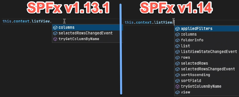
Figure 3: Comparing how many new properties exist on the context.listView property from SPFx v1.13.1 & SPFx v1.14
Most of these properties are self explanatory. They all apply to the current list view rendered on the page. For example, use the list property to get information on the current list and rows property to know what data is shown in the view, or what field it’s sorted on (sortField) and if it’s sorted in ascending order (sortAscending) or descending (sortAscending === false).
But, take notice of that listViewStateChangedEvent on the listView property. That’s the new way we get access to events. Let’s see how this works…
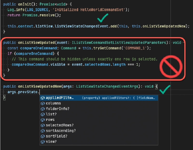
Figure 4: Comparing the old vs. the new way of handling list view events to get additional context
Figure 4 above demonstrates both the old way of handing events when the list view changes (up through SPFx v1.13) and the new way of handling it starting in SPFx v1.14.
What I’ve done is create a new list view command set extension with the default code. Here, you see the old onListViewUpdated() handler. This method has been deprecated which means it can be removed from the API in the future. Notice the two green checkmarks around the new code.
First, create a new event handler for the list view changed event. In Figure 4, I called that my onListViewUpdatedNew(). You then wire it up to the changed event, as I’ve done in the onInit() method, using the new listViewStateChangedEvent on the list accessor property available via the context.
This new event passes in a new event args type, ListViewStateChangedEventArgs, that contains a bunch of information. Notice how you can get the prevState of the list view and compare it to the current state as I covered previously. Pretty slick!
Except… if this is how we’re supposed to do it, why didn’t Microsoft update the new list view command set template to use he new style instead of keeping the old, and now deprecated, event? 🤷♂️
New APIs for Adaptive Card Extensions - card caching
For improved performance, SharePoint Framework now supports local caching of your Adaptive Card Extension’s (ACEs) card views. The cached card view will be immediately rendered when loading your ACE. After the ACE loads, it can optionally update the card view.
The cache can be configured to store the latest rendered card as well as the state of the ACE. Starting with SPFx v1.14, the cache is enabled with some default settings but can be customized by overriding the BaseAdaptiveCardExtension.getCacheSettings() method. This method returns an object of type ICacheSettings that contains properties such as the cachedCardView which can be used across page loads.
In addition to cards, you can override the BaseAdaptiveCardExtension.getCachedState() method to get cached values when the ACE is loaded. No state is cached unless you override this method.
This is capability as a developer preview feature in this release.
Learn more about this in the docs: Advanced card view functionality.
New APIs for Adaptive Card Extensions - new action types for media & geolocation
The second update for ACEs in this release includes a few new action types for both media & geolocation. They include:
ISelectMediaAction: trigger a file picker or native media pickerIGetLocationAction: get a locationIShowLocationAction: show a location on a map
This brings the list of actions, available via ISPFxAdaptiveCard.actions to six, in addition to the existing ISubmitAction, IOpenUrlAction, & IShowCardAction.
This is capability as a developer preview feature in this release.
These are all supported within the Viva Connections web client, but full support for mobile & desktop clients will come later.
New APIs for Adaptive Card Extensions - action error handler
Continuing with the ACE action topic, Microsoft has added an event that developers can handle when an error occurs within an ACE action. Simply override the BaseView.onActionError(error: IActionErrorArguments) method to handle your own errors.
This is capability as a developer preview feature in this release.
What’s fixed?
While previous release notes have listed a few bugs that were fixed, and linked to the associated issues in the issue list, but the v1.14 release includes a lot more than normal!
Check the fixed issues in the release notes and you’ll find over 20 associated issues.
Now… I know they’ve been going back and double checking issues that were marked as bugs to see if they had already been fixed and simply forgotten to update the issue in the repro. Some very well may fit that category, but some old one were fixed in SPFx v1.14.
For example, issue #3219 about application customizers was submitted on January 8, 2019 and wasn’t fixed until SPFx v1.14.
Finally… the issue list is getting some much needed attention!
What’s gone?
This release includes is not just about adding and fixing things, but some stuff was also removed and deprecated this time around.
Removed: Use SPFx web parts for Office Add-ins
In January 2020, Microsoft introduced support for creating Office Add-ins for Outlook using SPFx web parts. This was announced as part of the SPFx v1.10 release. But with nearly 2 years of no updates, late last year it started to seem like it wasn’t going to happen.
Then, in the SPFx v1.13.1 release, we pushed updates to the docs that indicated this was downgraded from “developer preview” to “experimental”.
Unfortunately, this release is going to fully back it out, as the IOffice interface & ISDKs.office object are have been removed from the SPFx API.
This means there are no current plans for using SPFx to create Office Add-ins.
Removed: legacy Microsoft Graph APIs
This release also marks the removal of the previously deprecated APIs for Microsoft Graph. Microsoft Graph support was originally introduced in the SPFx v1.4.1 release with the MicrosoftGraphClient API.
This API never made it out of developer preview and instead was replaced with the MSGraphClient in the SPFx v1.6 release.
Microsoft is just getting around to finally removing these old APIs we aren’t supposed to use. Why?
The original MicrosoftGraphClient API was an SDK for Microsoft Graph that the SPFx engineering team created. After creating it, the Microsoft Graph team introduced their own JavaScript SDK.
Well, the SharePoint team basically said ”We should just use their SDK, and we just provide the wrapper to initialize the authentication part of their SDK… then we have less to maintain!” And that’s exactly what the MSGraphClient API does.
So, this removal is just a formality of cleaning things up.
Deprecated: Local workbench from the environment type enum
The SPFx v1.13 release removed the local workbench from SPFx. But, we still had this enum EnvironmentType from the @microsoft/sp-core-library package that indicated it was still a valid option: EnvironmentType.Local.
Well, no more… because we can’t just delete it, it’s been marked as deprecated in the API so you’ve got a heads up that it will eventually get removed from the API.
Deprecated: Event when a list’s view is updated for command set extensions
As I covered previously, Microsoft has introduced a new way for us to get information when the current list view changes from a list view command set extension.
With the new event, it’s time to start moving on from the old API as the old way had a completely different signature. So, if you’re using the onListViewUpdated event in your existing list view command set extensions, be aware that this has been deprecated so you’ll want to start upgrading your projects to use the new listViewStateChangeEvent that I covered above.
What’s odd though is this deprecated code is still added when you create a new list view command set extension.
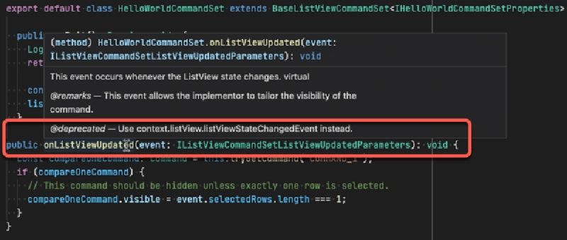
I don't understand... why add code in a new template that's clearly marked as deprecated? Why not add the correct code using the ListViewAccessor?
Conclusion
If you made it this far, then you probably have some perspective when I said this release, SPFx v1.14, was filled with a ton of news! That was a lot to get through!
SPFx V1.14 Release Notes
Get the official release notes here for SPFx v1.14 here: Microsoft: SharePoint Framework v1.14 official release notes.
My goal in this post was to give you a solid overview on everything you’ll find, and then some, in the SPFx v1.14 release.
If you found this useful, please share it… and if you have question or a comment about something in this post, let me know!

Microsoft MVP, Full-Stack Developer & Chief Course Artisan - Voitanos LLC.
Andrew Connell is a full stack developer who focuses on Microsoft Azure & Microsoft 365. He’s a 22-year recipient of Microsoft’s MVP award and has helped thousands of developers through the various courses he’s authored & taught. Whether it’s an introduction to the entire ecosystem, or a deep dive into a specific software, his resources, tools, and support help web developers become experts in the Microsoft 365 ecosystem, so they can become irreplaceable in their organization.
