Earlier this year I wrote on my blog how we needed some sort of a design language implementation for developers building Office 365 or SharePoint related applications or Add-ins. This includes applications that run within SharePoint (ie: SharePoint Hosted Add-in or SharePoint Provider Hosted Add-in), applications that run within Office clients (ie: Mail Add-in, Content Add-in or Task Pane Add-in) or self-standing web applications that are related to Office 365 in some way.
In that post ( Office 365 & Office App Dev - Customers Need a Modern Brand Implementation Pack), I wrote that…
What I think we need is a pack, distributable in a NuGet package as well as a Bower package, that includes all the CSS & JavaScript we need to easily implement all the common components in Office 365, SharePoint Online, SharePoint 2013 & Office Apps. What would this include? This would include things like:
- Layout
- Grids
- Tables
- Dialogs
- Alerts
- Lists
- Links
- Buttons
- Dropdowns
- Toggle Switches
- Quicklaunch / Menu
- Style
- Typography
- Themes (colors & effects)

Andrew Connell
Microsoft MVP, Full-Stack Developer & Chief Course Artisan - Voitanos LLC.
I pitched this as a User Voice submission, Provide a Design Implementation for O365, SPO, SP2013 & Office App Developers, and was thrilled to see the conversation that started and that it jumped to 234 votes.
Well guess what, today it finally became a reality! After seeing a sneak peek back at //build in April 2015, Microsoft has released the first version of the Office UI Fabric! You can check out the announcement blog post here: Introducing Office UI Fabric—your key to designing add-ins for Office.
I’ve had a chance to play around with it and have to say I’m quite pleased. Just about everything I put on my original list above is covered, and so much more! And the best part is that it can be used in any web project… not just SharePoint Add-ins or Office Add-ins… it can be used in anything. I’ve used it to build an Office Task Pane Add-in and a stand alone Angular application for a fantasy football draft:
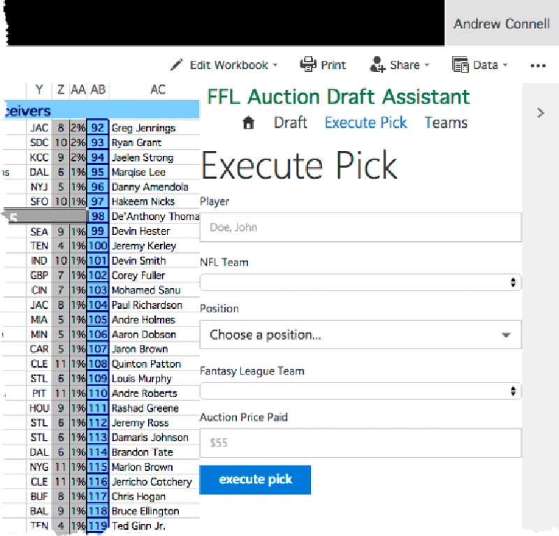
Office UI Fabric - AddIn
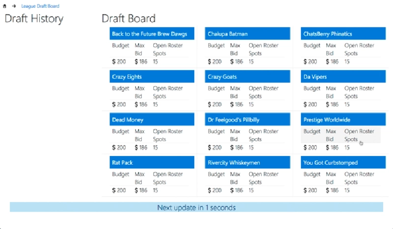
Office UI Fabric - DraftBoard
I’m pumped about these… we’ve been wanting these for a while!
What the Office UI Fabric Includes
The Office UI Fabric includes a few things that fall into two categories.
Office UI Fabric Features
The first category, Features, includes the following:
- typography Typography includes CSS classes that you can use to implement the same text that is used across Office.
- color Use Office theme colors, neutral colors (different shades of gray), brand colors for different products & accent colors…. all of these come in backgrounds, text, border and different shades.
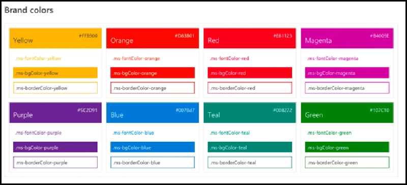
Office UI Fabric
Colors
icons If you are familiar with things like FontAwesome, the Office UI Fabric includes icons that are specific to Office, including product logos.
animations Want to mimic the same animations Office uses? just add a CSS class!
responsive grid This follows the popular 12-grid format.
localization This includes right-to-left support for those languages, such as Hebrew & Arabic, as well as language optimized fonts.
To use any of these, just include a single CSS file that is provided both as a download, bower package , or use the CDN link:
https://appsforoffice.microsoft.com/fabric/1.0/css/fabric.css
Office UI Fabric Features
The other thing you’ll find are components. These are UI artifacts that we’ve wanted to mimic in our applications so that our apps look just like Office / Office 365 / SharePoint. There are tons of things in here… broken down into categories such as inputs, layout, navigation & content:
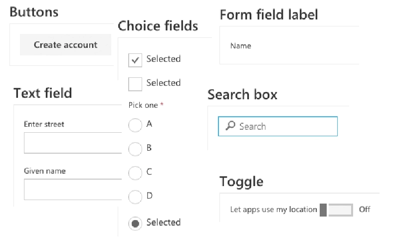
Office UI Fabric
buttons, choice fields, form field labels, text boxes, toggles, search box & dropdown lists
Office UI Fabric
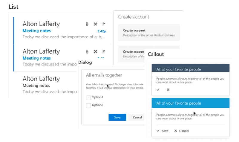
list & dialogs
Office UI Fabric
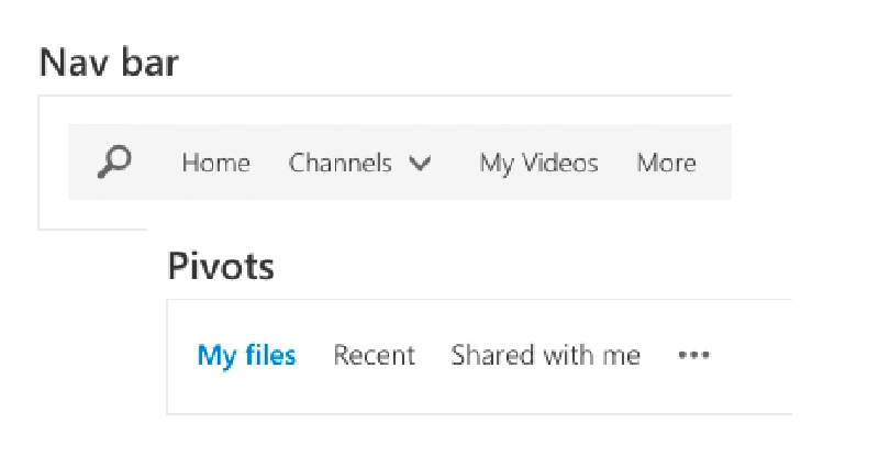
nav bars, pivots
Office UI Fabric
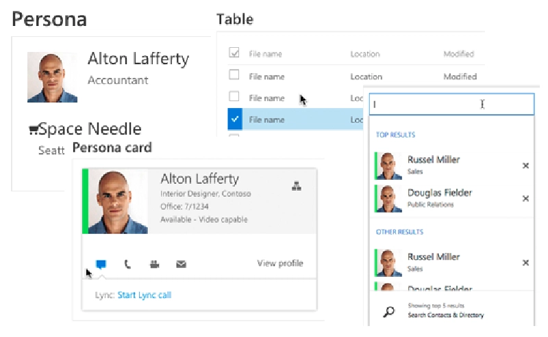
persona, persona card, people pickers, list items, spinner & table
How the Office UI Fabric is Implemented
Microsoft implemented the Office UI Fabric using a common pattern. They are based on jQuery, so you will take a dependency there. For the features, you simply use different CSS classes to implement any of the things I’ve listed above. Many of the components work the same way except you will likely follow a specific pattern with the HTML and classes you use. For instance, this is what a table looks like that I added to my fantasy football app. The first row is automatically treated as the header row for the table:
If you don’t see the code, you’re likely viewing this within a RSS reader or email… go to this post on my blog to see the code.
To implement this grid I had to add two CSS references; one for the typography & another for the component’s CSS. In addition, other components, like the dropdown control, require that you include an extra JavaScript file and then run the provided function to process the HTML to implement it:
What’s Next?
Pretty slick! The only thing I wish we had were these same controls implemented as Angular directives, the same way we have projects for Angular Bootstrap, aka UI Bootstrap, or Material Design for Angular, aka Angular Material. I’m looking forward to see if this is on the roadmap for Microsoft. I see the project is open to contributions… I’ve started the discussion so let’s see where this goes: Issue #55 - Angular Directives for UI Fabric Components.

Microsoft MVP, Full-Stack Developer & Chief Course Artisan - Voitanos LLC.
Andrew Connell is a full stack developer who focuses on Microsoft Azure & Microsoft 365. He’s a 22-year recipient of Microsoft’s MVP award and has helped thousands of developers through the various courses he’s authored & taught. Whether it’s an introduction to the entire ecosystem, or a deep dive into a specific software, his resources, tools, and support help web developers become experts in the Microsoft 365 ecosystem, so they can become irreplaceable in their organization.


