Learn About Voitanos 2.0
A lot has changed since this article… want to learn about the new-NEW website? Learn more about Voitanos 2.0, an effort I started rolling out in October 2024:
- Wave 1: Concepts Made Clear: Introducing the New Voitanos Brand (October 2024)
- Wave 2: Voitanos 2.0 - Realizing the New Brand with a New Website! (March 2025)
- Wave 3: estimated Q2 2025
- Wave 4: planned H2 2025
Over this past weekend, we rolled out a brand new voitanos.io website! This is the first major refresh of the site since we launched Voitanos in 2017. You’ll notice a ton of improvements, new features & sections, content updates and an overall better experience. In this post, I’ll share some of the new and improved aspects to the site.
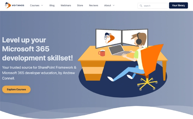
New Voitanos website homepage
But first, I need to explain something… I broke the site up into two different URLs.
Splitting the site
When I launched Voitanos over 3 years ago, I wanted to focus on building the course. I needed a website, but I didn’t want to spend any time building it so I could focus on the course. The service provider I selected handles everything today from the public website to the store, membership management, and course delivery.
The public website is what’s changed. I’ve pulled it out of our service provider and reimplemented it using a different tech stack on a different host. The existing domain www.voitanos.io points to the new site, while a new URL courses.voitanos.io is used for everything else.
The courses.voitanos.io site was retired in April 2025 in favor of the new Voitanos Learn student experience at learn.voitanos.io.
For existing customers, there’s no impact to your existing logins, your course progress is retained, and all comments on existing lessons are still there.
To be clear - nothing is changing with the courses or your library with this new site rollout.
What’s different
Let’s look at what’s changed to the existing site with this rollout, then I’ll dive into some of the new features.
Site responsiveness & speed
Other than a new look and feel, this is the biggest change to the site. You may notice the site loads a LOT faster than it did previously. There are a few reasons for this. The previous site (where the courses are served from on learn.voitanos.io), was served up by the service I use to primarily handle the store, membership management & delivery of the courses. I didn’t have much control over how the site was implemented or their tech stack.
This meant I couldn’t do some optimizations and were stuck with the stuff they injected into every page. While that worked for most of their customers, and it worked great for us to focus on the course content, it wasn’t ideal for the best experience.
The new site is implemented as a static site generated by Hugo, hosted on Microsoft Azure, behind an Azure CDN. The entire site resides in a private GitHub repository and is automatically built & deployed to Azure when I update the content/code. If you want to learn more how this works, I wrote how I did the same thing with my blog… go read the posts in the “Hugo” category to learn more.
Frequently asked questions
The frequently asked questions also got a lot of attention in this update. I updated the questions & answers, added some entires for questions we had been receiving, created categories of questions as well.
Organization, content and readability
You’ll notice some of the content pages have received a lot of attention. Most specifically is the page for the premiere course I have: Mastering the SharePoint Framework. I added a lot more information about the course, a full listing of all chapters in each course bundle and reviews from students who’ve benefited from the course!
In addition to the course pages, every page in the site is much more readable and follows the modern standards for content sites.
Revised the Terms & Conditions, Privacy Policy, and Subscriber/Licensing Agreement
When you update your terms or privacy policy, you have to tell your customers. These changes were mostly just copy edits and clarifications to questions we got about some of our policies. No new policies were added or existing policies were changed.
What’s New
Now for the fun stuff!
Finally - SEARCH!
Yes, the site now finally has a search box on every page. Set in the top navigation, you can find anything on the site, powered by Azure Cognitive Search, it was almost too easy to implement I felt bad it wasn’t already on the site.
New section: webinars
Previously, all webinar recordings were buried as old blog posts. No more! Webinars now have their own dedicated section /webinars!
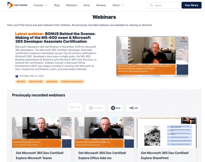
All future & previously recorded Voitanos webinars
Here you’ll find all future and past webinars. These are also integrated into our RSS feed so you’ll learn about upcoming webinars right away.
New section: reviews & testimonials
I’ve been long overdue in sharing what some of our customers have said about our content. This new section for customer /reviews highlights what existing customers have been saying about out courses and newsletters!
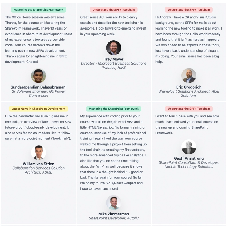
Customer reviews & testimonials
Wrapping it up
While there’s a lot more to the new site, these are the highlights I wanted to call out. I hope you enjoy the new look and speed of the site!
If you see something wrong, please let me know!
Now I can get back to working on the next course! Stay tuned!

Microsoft MVP, Full-Stack Developer & Chief Course Artisan - Voitanos LLC.
Andrew Connell is a full stack developer who focuses on Microsoft Azure & Microsoft 365. He’s a 22-year recipient of Microsoft’s MVP award and has helped thousands of developers through the various courses he’s authored & taught. Whether it’s an introduction to the entire ecosystem, or a deep dive into a specific software, his resources, tools, and support help web developers become experts in the Microsoft 365 ecosystem, so they can become irreplaceable in their organization.


